Jean Rouppert as the designer of Gallé lamps in the early 1920s
With an additional note on a previously unreported type of signature.
Établissements Gallé lamps after 1904
One of the main advances from the last decade in our knowledge of the Gallé operation after WW1 is the recognition of the artist Jean Rouppert as the composer in chief for the glass series. Until then, the authorship of Gallé late designs was mostly given to Auguste Herbst, who held the position of artistic director for the Établissements Gallé, after the passing of Louis Hestaux in 1919, and who, as such, had the supervision of all designers, including Jean Rouppert. But, thanks to his family archives, carefully curated by Ronald Muller1, we know now that the talented Rouppert played a major role in the Établissements Gallé development, in the crucial period of their recovery from the war, up to his departure in September 1924. In previous articles on this website, I’ve recounted how he showed early promise and almost left the company to found his own in 1913-1914; how he was promoted designer in 1919 and how he was responsible for the introduction of a new distinctive Gallé signature (the Mk V one), with which he marked his creations; and I researched in depth one of his last popular designs for glass series, the 1924 Glaïeuls. But much remains to be discovered about his work at Gallé’s. His attempt to find new shapes for the electrical lamps represents such an instance.

As we’ve seen with the striking examples of the Coprins lamp and the Cylène lightbulb cover, early Gallé creations in this field were characterised by complex naturalist designs, where the foot and the shade of the lamp were modelled after the botanical species Émile Gallé took his inspiration from. After his death, the Établissements Gallé rapidly streamlined the shapes in use for the lighting fixtures as well as for all glass series. As the pictures' gallery section of Duncan and De Bartha’s book on Gallé lamps shows, they were restricted to a few general functional types (table lamps, bedside or reading lamps, suspensions and wall sconces). Within these, variations in shape were rather modest in scope and conservative in style, closely following for the most part the general profile of the so-called mushroom lamp, for the main lamps: a cylindrical or spindle-shaped foot bearing either a semi spherical cap of some sort or a conic one. The shorter bedside lamps, on the other hand, had stockier, ovoid or pear-shaped bodies. The 1927 Gallé sales catalogue kept in the Rakow Library offers 27 different such examples of these two generic categories (see the plate above). Numerous discrete changes in the profile for both the body and the shade were introduced over the years, without altering the overall aspect of these mushroom lamps. The annual overhaul of the commercial line was mainly achieved by switching the cameo-etched decor (flowers or landscapes for the most part), rather than by researching new shapes.
The two-tiered onion dome lamps with an ivy decor
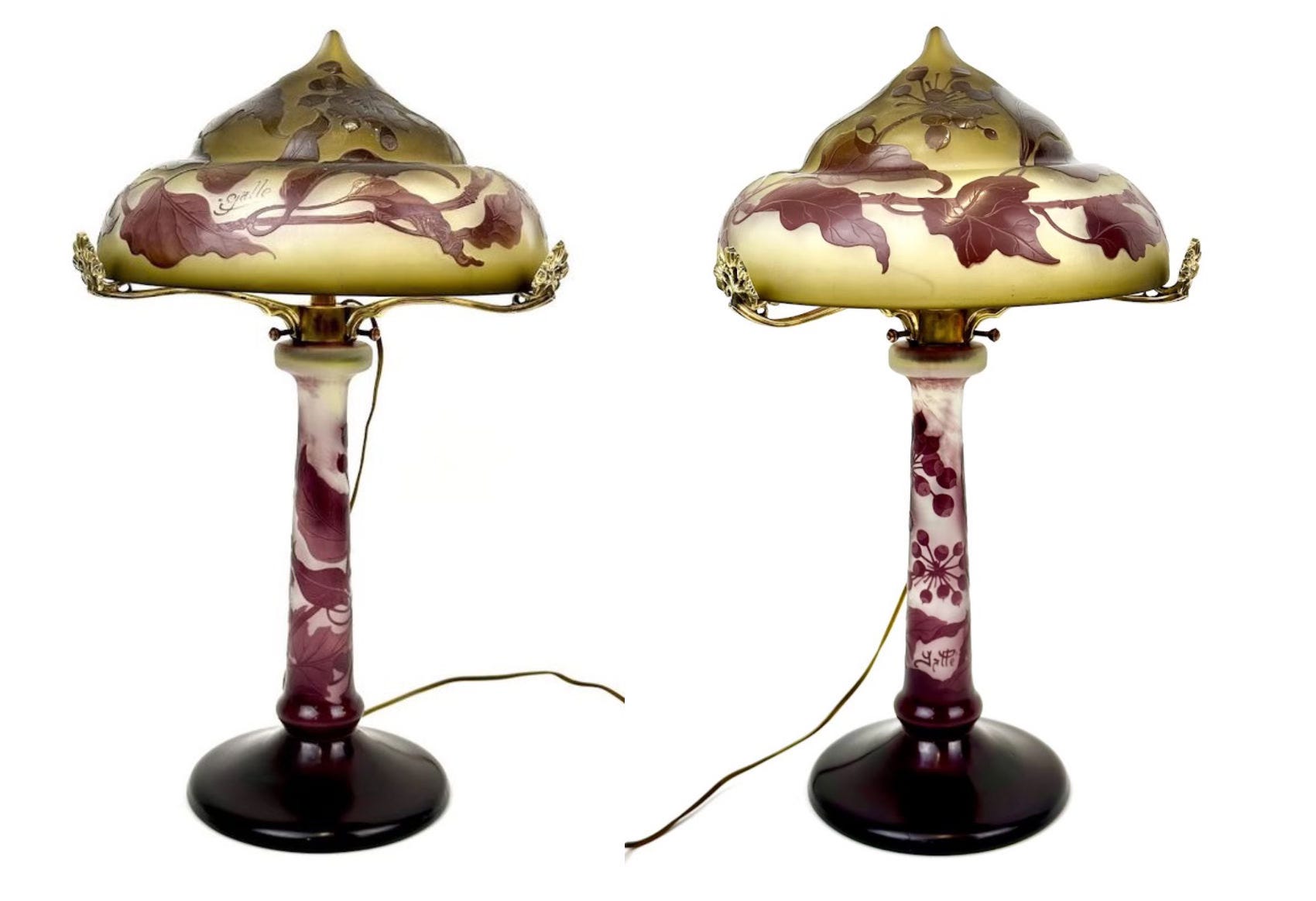
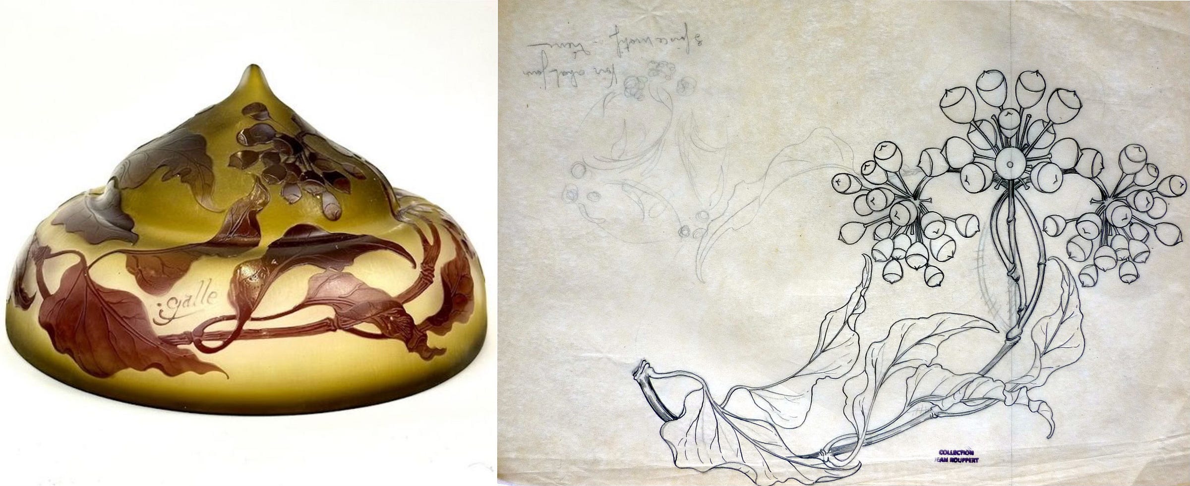
A few exceptions do exist, and one of them is currently on display in one of Nancy’s antiques’ dealers shops: this 40 cm high lamp presents a tubular foot with a single ring near its lower end, widening on a disk-shaped base; the shade, of 22 cm in diameter, has a two-tiered pointed dome shape, reminiscent of some onion dome architecture or, alternatively perhaps, some headgear from the Middle East. The architectural inspiration is perhaps the fantasy or fictional types rather than some historical ones anyway. This rare and unusual lamp is missing from the extensive Duncan-De Bartha catalogue, as well as from the Corning album and the various pictorial handbooks about Gallé. Its authenticity leaves no doubt however: it’s a cameo two-layers, violet on green and opal, glass piece, with a classic ivy pattern (Hedera Helix), known from other shapes, with the same chromatic combination or others.

Both parts feature a Gallé signature, but a different one, a subtype of the Mk V on the foot (Mk Vb, without the usual underlining stroke), and a variant from the Mk III one (with a latin “é” but see the appendix below) on the cap. This kind of mismatch is not uncommon on lamps, and it does not necessarily signal a later pairing of parts from two different original objects – too common an assumption. In this case, there is every reason to surmise that the combination comes from the factory: not only the patterns and colours on both parts do perfectly match, but another example of the same lamp series sporting the same pair of signatures was sold by Drouot Estimations on May 11, 2021 – wrongly described as featuring a laurel pattern. These are two distinct specimens of the same series, as minor defects and differences can attest.

The most glaring one lies in the metallic mount of the shade: while the Drouot specimen sports a simple unadorned one, with flat plain clips to keep the lamp’s cap in place, the Nancy specimen has gilded bronze hooks, moulded in a floral (umbel?) shape. On top of looking almost pristine – which suggests that perhaps the gilding was renewed – they are not a close fit for the shade, with too much space between the tip and the glass. It would seem therefore that the mount was not the original one meant for this lamp series and that this specimen’s was replaced, which makes sense since the electrical fittings have also been changed – a fact acknowledged in the dealer’s description.
In contrast, the glass work shows only minimal differences between the two specimens, as expected in an industrial series, in particular in the etching of the signatures: they belong to the same type, but they show the usual slight variations coming from their execution from a different hand. It follows that the series was made with these mismatching signatures, that can be explained by a slight time-lapse between the making of the two parts or perhaps by the fact that the pattern stencils used by the decorators were not made by the same draughtsman. Or, of course, it could be intentional, for decorative, commercial or protective reasons we do not know about.
Whatever the case might be, the Mk V signature on the foot (recognisable for its downward inverted curve of the capital G’s leg and the double-crossed LLs) gives a good chronological marker, as the signature associated with Jean Rouppert’s designs, between 1920 and 1924.
The lamps compositions in Rouppert’s archives
Confirmation of this attribution comes from several drawings in the Rouppert archives. At an unspecified date, during his time in the Gallé factory, Jean Rouppert made a peculiar series of (at least) 41 compositions for glass, i.e., watercolours depicting projects of glass objects. The drawings stand out, among the thousand or so pictures in his archives, by their identical technique, layout and medium, as well as by their closely related subject. While they do not bear any date, in contrast with some other drawings, these shared characteristics suggest that they were made over a short period, perhaps as a portfolio of projects for a specific line of products or answering a particular request.
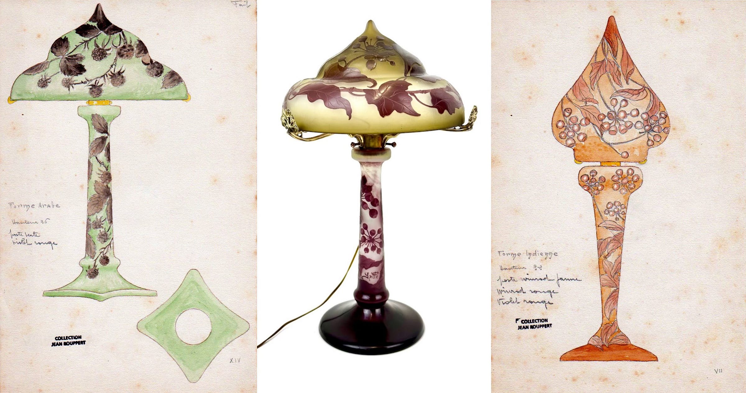
Each composition shows, as the main drawing, the full profile of a piece with its decor, sometimes with one or two secondary drawings for additional technical details. Annotations, from Jean Rouppert’s hand-script, give the overall size of the object in centimetres, the sequence of its coloured glass layers, sometimes the shape’s name. They are unsigned, not even bearing the “JR” initials found on so many of his drawings, but the written notes do not leave any doubt as to Jean Rouppert being their author. The compositions were grouped together by being numbered, in Roman numerals, and five of them bear the mention “Fait” (Done), as an indication, presumably, that the project had been approved and put in production.
The first 18 compositions are lamps, and two of them are closely related to the Lierre lamp discussed here, thus confirming Jean Rouppert’s authorship for this design. The lamp’s specific profile is given by the drawing numbered XIV, save for a minor detail: the base is not a disk, as in the existing specimens, but a kind of square with rounded corners. The profiles of both the shade and the foot, on the other hand, are the same as in the two known specimens. The original shape of the lamp’s cap is named “Forme Arabe” most probably a generic reference to some architectural feature – perhaps a door’s or niche’s opening rather than a dome – vaguely reminiscent of Muslim Arab architecture.

In his series of projects, Jean Rouppert used three different historical generic “ethnic” names to label most of his lamps’ compositions, with 3 of them dubbed Slavic (“Forme slave”, No. I, II, and III), 4 Indian (“Forme indienne”, No. IV, V, VI, and VII), and 2 Arabic. (“Forme arabe”, No. XIII and XIV). To some degree, they all look like some variations on the onion dome shape, but they could also be related to some distinctive regional headgear: for instance, the “Slavic” ones could be compared to the kind of high-crown cap that some secular and church officials used to wear in the Northern Balkans in early 19th century, the ishlik or some Eastern Orthodox mitres. One of the “Indian” ones evokes the pandita hat worn by Buddhist monks. There may have been a single printed pictorial source for the series, but it’s yet to be identified. These “ethnic” shapes themselves do not have a separate number. They are probably meant to allude to a general style rather than to a specific existing shape.
The common theme of the series is a renewal of the generic lamp shape, with an emphasis on the shade. The decor patterns, on the other hand, fall mostly under the traditional Gallé répertoire of floral or landscapes compositions, with one or two exceptions. In every case, the disconnect appears complete between the decor and the shape: for instance, a “Forme indienne” depicts a dromedary driver and his mount over a desert landscape (No. VI, see the gallery above), while the Strasbourg’s city skyline, with its one-towered cathedral, and a flight of storks adorn a “Forme slave” (No. II) – the decor was eventually made with a more classic shape.
Shape and decor are, therefore, interchangeable, as the Lierre lamps can confirm. If the shape refers to model No. XIV, one of the “Arabic” designs, whose composition shows a mulberry decor, the actual lamp’s pattern is taken from model No. VIII, which was made for an “Indian” shape (see above). Late Gallé Mulberry lamps do exist, but with the more classic shapes, and not these exotic looking shades.

In most cases, it seems, the decor alone has been kept, and applied to a different lamp shape, both for the shade and the foot, as far as can be determined by the known specimens. One of Rouppert “Slavic” projects, with a bulbous irregular shade, and a decor of a fish in running water, over some algae on the foot, has thus been made with an entirely different shape, as shown above in the example from the Kitazawa Museum of Art, for instance. On the other hand, a shape may have been kept for another decoration, as demonstrated by an onion dome-shaped lamp with an orchid pattern, whereas the original had geese (or maybe mallard ducks?) flying over a pond.
Besides the colour composition, other graphical documents in the Rouppert archives can confirm the actual production of the model. These are the stencils and pricking patterns used to transfer the design’s drawing on the glass, for the painter decorator to trace it over with a special acid-resistant varnish. In the case of the Lierre lamp, one such stencil is preserved, bearing the hand-scripted note “Voir abat-jour. 3 fois ce motif. Lierre” – an indication that the same stencil had to be applied thrice all around the shade. The comparison of the stencil with the made lamp shade checks out. It adds a nice chronological bit of data, making September 1924 the terminus ante quem for the making of the lamp, since Jean Rouppert took the drawing away with him, when he left the Établissements Gallé at that date.
Emulating Émile Gallé’s designs: the snowdrop series
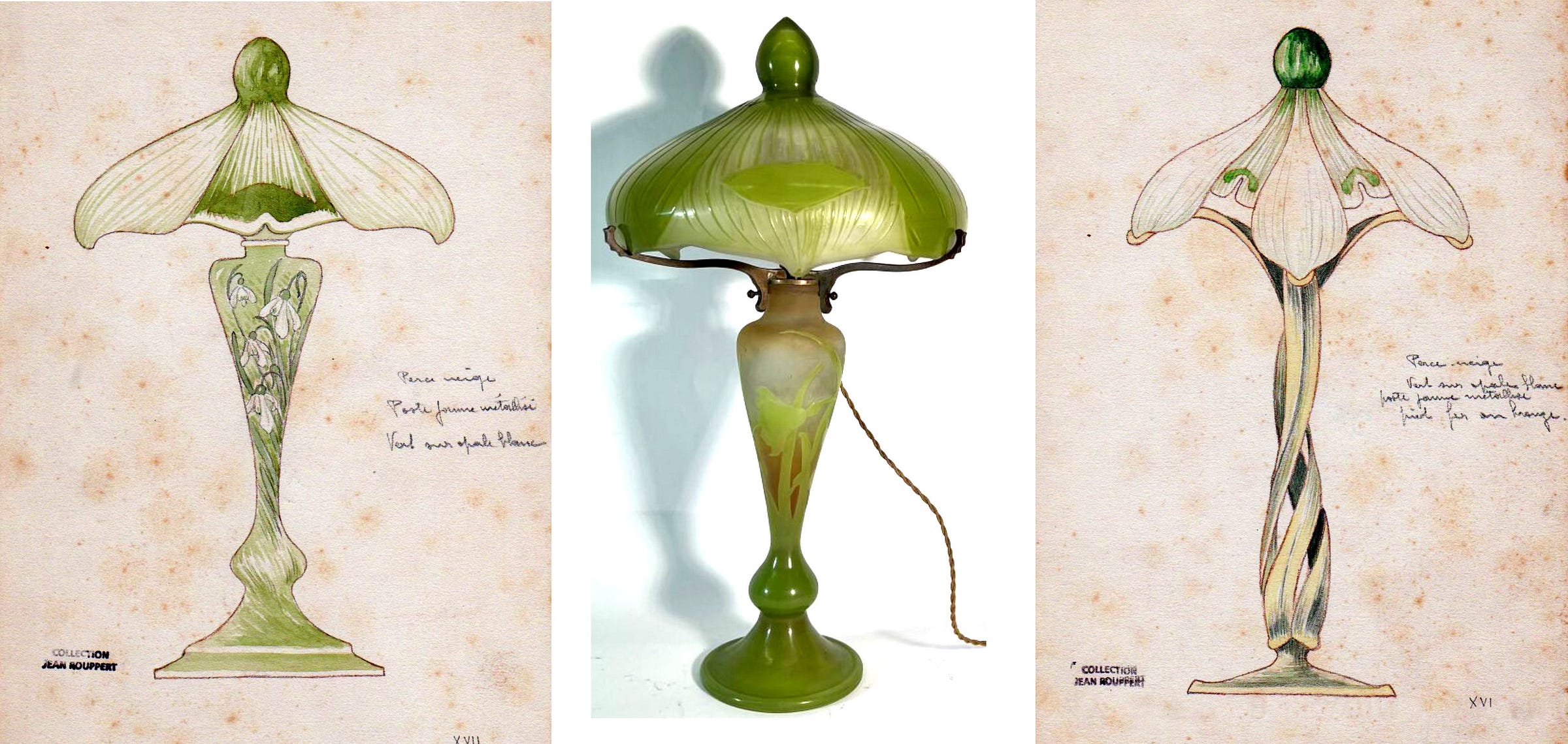
The lack of a “Fait” mention inscribed on the drawing does not imply that it was never made. One at least of these designs lacking such mention is attested as having been made, the Perce-neige (snowdrop, Galanthus nivalis) table lamp (see above). The specimen sold in Metz a year ago looks like a close enough glass version of the drawing, colours included, for Rouppert had indicated “poste jaune métallisé, vert sur opale blanc”.
Jean Rouppert designed a whole series of pieces on the theme, not limiting himself to lighting fixtures, but including a cup, a charger, and a candy box (projects Nos XVI to XXII in this Roman numbered series). He might have been inspired by Émile Gallé’s early creations on the same floral theme (see the figure below): for the first time in a very long time, perhaps even from 1904, a Gallé lamp shade’s shape bears some resemblance with the flower’s structure, with both the calix and the corolla clearly identifiable in the design. The intention, judging from the drawing, is clearer though than the execution, the finished piece being, in the end, quite similar to the usual mushroom lamp. But still, in spirit, the Rouppert project is a throwback to Émile Gallé’s time. The comparison is enlightening insofar that he shows the evolution of the design between the early 1900s and the early 1920s, both in a naturalist style, but with some evident simplification for the latter.

This is all the more clear in the comparison between the two iron footed versions. Like Émile Gallé, Jean Rouppert did two versions of his Perce-neige table lamps, the first with a slender glass foot, and the second with a metallic one (in bronze or iron, says the note). Where Émile Gallé’s version has a delicate, even fragile looking stem, carefully modelled after the plant in every detail, Jean Rouppert has a stylised linear but still elegant lamp stand, made from three interwoven long leaves. As intricate as this latter design looks, it is still a far cry from Émile Gallé’s creation. There must be more than a simple coincidence though, and it seems highly probable that Jean Rouppert was asked to, or that he took upon himself, to emulate the master in giving a new life to an old and prestigious design.
Rouppert’s frustrated creative spirit
The extreme rarity of these snowdrop-themed creations (I could not even locate a specimen with a metallic foot) hints at a lack of commercial success, an observation also valid for his other compositions, and not only the lamps, from the same portfolio. It looks like Jean Rouppert quickly reverted (or was asked to do it) to more common shapes and decors, like his Glaïeuls series.
As I explained in a previous paper2, Jean Rouppert was frustrated, from the beginning of his employment in the Établissements Gallé, by the lack of artistic freedom he experienced, first as an anonymous painter decorator in 1913-1914, and then even as the main designer of glass series. He might have expected, when he succeeded Louis Hestaux in 1919, that he would be able to show his creative talent and to put it in the service of the renewal of the Gallé line. In reality, the vast majority of his compositions showing some originality were discarded by the Gallé management team, under the conservative supervision of Paul Perdrizet. A few remarkable projects slipped through, like his dragon-like Gouafre3, but these were not enough to content him, which led, with the lack of improvement in his financial situation, to his departure. The Roman numeral numbered series in his archives show what was lost then for the Établissements Gallé.
Appendix: a new signature’s type from the early 1920s, the dotted Mk IIIc subtype
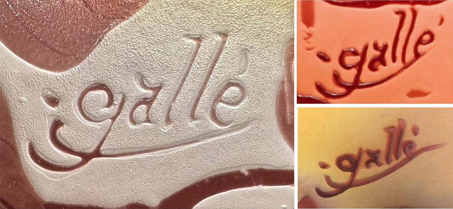
The attribution of the Lierre onion domed lamp to Jean Rouppert comes with an additional benefit, the identification of a hitherto unreported Gallé signature. Shrewd observers will have noted that the signature on the lamp’s shade is no ordinary Mk III type: it comes with a conspicuous dot on the left side of “Gallé”, in the extension of the stroke underlining the name. As a close-up picture of the Nancy specimen makes clear, this dot is intentional: it’s neither a defect of the decor nor can it be dismissed as the cut-off end of the underlining stroke. It cannot be confused with a star, either.
That would be the easy mistake to make – and indeed it was implicitly understood as such by the Antiquités Art Nouveau store owners, since they dated the lamp from 1904-1906 (before changing it after reading this), that is the traditional, if slightly erroneous, timeframe assigned to the Gallé-with-star signature (the Mk II type in my nomenclature). The specific location of the star in the Mk II subtypes can vary a little, but it is overwhelmingly (if not always) spotted to the left of the name, either nested in the G’s lower tail, below the underlining stroke of the signature, or just above and often in the extension of the underline, in other words in the exact location of the dot on our lamp’s signature. It also happens quite frequently that the acid-etching damages the star’s design, erasing part of its branches and leaving its center looking like an irregular blot rather than a star.

See for instance the Hortensias gourd above, from a well-known series from the mid-1900/1910 decade, where the star lost its branches, in a Mk II signature . Another example comes on an orphan lamp’s foot with a Buddleia pattern: the missing corresponding shade almost certainly featured the butterflies associated with this flowering plant known as the butterfly-bush. Here, the star on the Mk II is indeed reduced to a blurred blot, while other specimens from the same series show that it was meant to be a five-branches star.

If we compare now these botched Mk II signatures with the one on the Lierre lamp, the difference is clear: the latter is a different mark.
This signature has never been reported before, to the best of my knowledge. It’s missing from Hartmann’s Glasmarken Lexikon, Le Tacon’s works or Olland’s Dictionnaire des maîtres verriers, just to name the largest available compendiums. The reasons of this absence can easily be explained: a frequent confusion with the Mk II type, its apparent rarity, increased, perhaps, by its easy removal by unscrupulous dealers or owners, in the same way the star has been erased on many glass pieces from the 1905-1908 period.

The signature is also missing from my general typology of Gallé marks after 1904: I had noticed it on a Roses vase which was obviously, from a technical perspective, from the 1920s, when I was collecting signatures to build the database to support my nomenclature (see the figure above, right). But I had dismissed it as a quirk oddity to be investigated later. Another vase, the unusual red and yellow Nénuphars et sagittaires, I had actually filed with the Mk II signed pieces (see above, left). It took the association of this signature with the Mk V on the Lierre lamp to recognise that it was a legitimate signature from the early 1920s.
This new signature, which I will label the Mk IIIc, with a date ca. 1920-1924, therefore takes its place as an alternate to the usual Mk III, whose general characteristics it borrows: the Gallé name, underlined with a stroke that intersects with the capital G’s tail, whose curve is ascending toward the left, and has an elongated dot to its left. One important note is that it shares with the Mk IIIb subtype a final Latin “-é”, rather than the much more frequent Greek accented epsilon “-έ”. This may suggest a new understanding of the alternate use of -é/-έ, since the other signatures of the Rouppert period, the simple Mk IV and the more elaborate Mk V share (at least in my observations so far) the almost exclusive use of the final Latin -é. Confirmation of this hypothesis will require a further study, but it looks like the Établissements Gallé dropped the Greek letter in their mark, in the first years after the First World War, before reintroducing it circa 1924-1925 with the Mk VI and Mk VIII types.
In any case, this also reinforces the need to reevaluate the general chronology of the various Mk III types. The hypothesis of its discontinuance in 1920, or shortly thereafter, is challenged, as it looks like its phasing out (if that’s still the term to use) stretched well into the mid-1920s.
© Samuel Provost, 26 December 2023.
Bibliography
• Duncan A. and De Bartha G. 2013, Gallé Lamps, Woodbridge, Antique Collectors’ Club Ltd.
• Provost S. 2018b, « Les Établissements Gallé dans les années vingt : déclin et essaimage », Revue de l’Art, 199, 1, p. 47‑54.
• Provost S. 2018c, « Quelle direction artistique pour les Établissements Gallé après 1914 ? Les relations de Paul Perdrizet avec les artistes Gallé », in Gril-Mariotte A. (dir.), L’artiste et l’objet. La création dans les arts décoratifs (XVIIIe-XXe siècle), Rennes, Presses Universitaires de Rennes, p. 213‑223, pl. XXV‑XXVIII.
Notes
All pictures of Jean Rouppert’s compositions in this article are credited to him and I thank him again for his help and generosity on the matter.
Provost 2018c, ill. 1, p. 218, and pl. xxvi.
How to cite this article : Samuel Provost, “Jean Rouppert as the designer of Gallé lamps from the early 1920s. With an additional note on a previously unreported type of signature”, Newsletter on Art Nouveau Craftwork & Industry, no 27, 26 December 2023 [link].


Encore un excellent article.